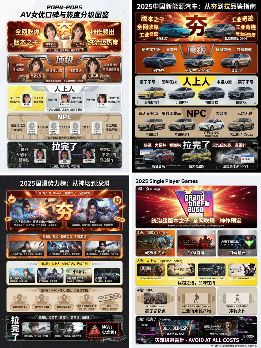
A complex Chinese prompt for Nano Banana Pro designed to generate a 'Hāng to Lā' (Good to Bad) rating infographic using a Bento Grid layout. It instructs the AI to research a user-specified topic (e.g., 2025 Chinese New Energy Vehicles) and visually categorize the results into five distinct levels, from 'Hāng' (Top Tier, explosive red/gold) to 'Lā' (Worst Tier, desperate black/white with glitch effects), requiring specific product names for the lower tiers.
提示词
[Core Task Instruction]
You are an AI expert with real-time web search capabilities and top-tier data visualization design skills. Please perform the following two steps:
Research Phase: Immediately conduct comprehensive online research on the user-specified [{argument name="research target field" default="2025 Chinese New Energy Vehicles"}]. Collect public reputation, market popularity, professional reviews, and user feedback data on different sub-products, models, or works within this field.

Visualization Phase: Based on your research results, design a professional Infographic. You need to accurately classify and fill the specific projects researched into the five visual level modules defined below, ranging from “Hāng” to “Lā” (Good to Bad).

[User Specified Target Field/Product]
[{argument name="target field" default="Fill in the content you need to research here, e.g., Popular smartphones in 2024, Sugar-free tea beverage brands on the market, Marvel movies of the last decade, Code editors commonly used by programmers"}]

[Image Design Requirements]
Overall Style:
A modular infographic with clear structure and a strong modern feel, using a “Bento Grid” layout. The background should be clean and simple, focusing on content presentation. Visually, it must show a strong hierarchical drop-off from high to low.

Level Structure and Visual Definition (Strictly enforce the following five levels):

Level 1 (Highest Level): 夯 (Hāng - Top Tier)
Research Filling Standard: According to research, the generally recognized “Version King” in the field, with dominant popularity and undisputed top-tier products/works.

Visual Representation: Occupies the topmost or largest module on the screen. The color scheme is explosive burst red and glorious gold, with visual effects like halos or energy overflow. The font is the largest and boldest. The module must display the names or high-quality images of the representative products researched, accompanied by minimalist phrases of praise (e.g., “Blown up across the internet,” “Masterpiece”).

Level 2: Top Tier

Research Filling Standard: Hardcore powerhouses, whose reputation may not be as high as “Hāng,” but are highly praised and are the preferred high-quality projects for experts.

Visual Representation: Located on the second layer. The color scheme is solid, high-end burning orange and metallic silver. The module design appears robust and textured. Display representative powerhouse products.

Level 3: Superior

Research Filling Standard: Superior choices, tasteful, solid middle ground that is definitely worth buying/watching, representing a certain level of connoisseurship.

Visual Representation: Located in the middle layer. The color scheme is bright, clean lemon yellow and cool gray. The design style is modern and refreshing. Display representative high-quality middle-class products.

Level 4: NPC

Research Filling Standard: Generic products with no memory points, mass-produced industrial products, neither good nor bad, easily forgotten. Must include specific product or brand names, do not be vague.

Visual Representation: Located in the lower-middle layer. The color scheme is dull and bland bread color/beige or cardboard brown. The module design appears ordinary, repetitive, and lacks personality. Display those very mediocre products.

Level 5 (Bottom Level): 拉完了 (Lā - Failed)

Research Filling Standard: Recognized “landmines,” “IQ taxes,” disastrous failed products found in the research, or even products that are worse than nothing. Must include specific product or brand names, do not be vague.

Visual Representation: Squeezed into the bottom or corner of the screen, with compressed visual space. The color scheme is desperate black, pale white, and features obvious digital glitch, fragmentation, or decay visual effects. Display those famous “flop” products, accompanied by warning phrases (e.g., “Run away,” “Big sucker”).